Back to projects
🚂 CFR (Romanian Railway System)
Tools: Figma
Project Type: Mobile App Redesign

The Problem
Purchasing tickets from the application is a hard task for users as the entire app fails to offer the necessary details and to structure the information in an easy & straight-forward way
The Goal
The goal of this project is to optimize the existing flow thus helping the user complete their goals fast and with ease. Moreover, by improving the experience, the UI elements must also be taken into consideration.
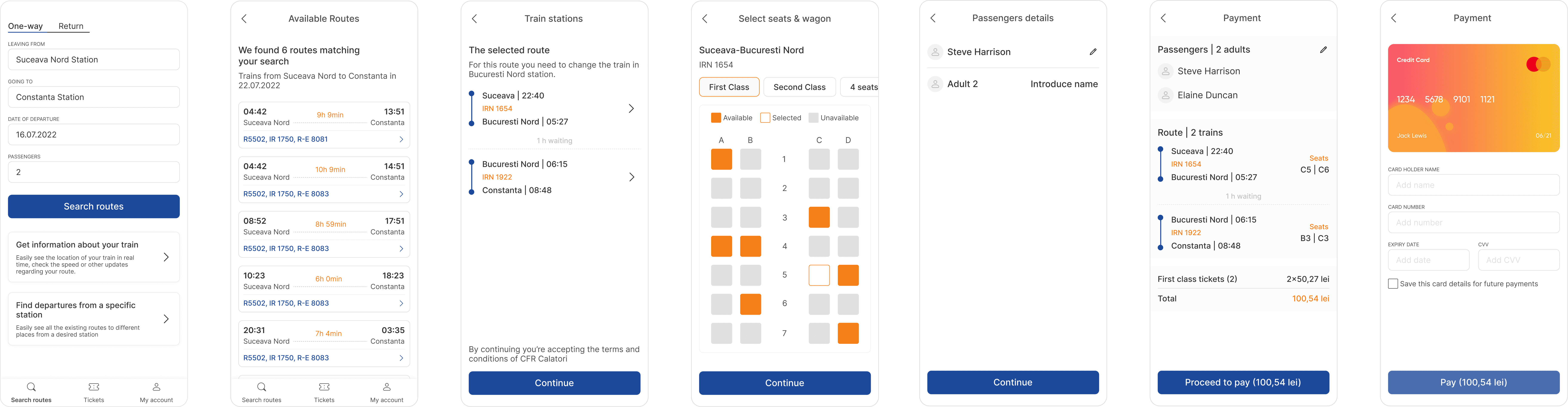
Optimizing the flow | Booking a ticket
For authenticated users, booking a ticket is a 9-step journey, while for non-authenticated users, it requires 10 steps to complete the desired goal. The main problem with this flow is the fact that users have no confirmation whether there are any tickets available for the route selected or not. Only in the final steps, in the cart overview, the users can find whether there are any available seats.
Existing flow for authenticated users that want to purchase a ticket
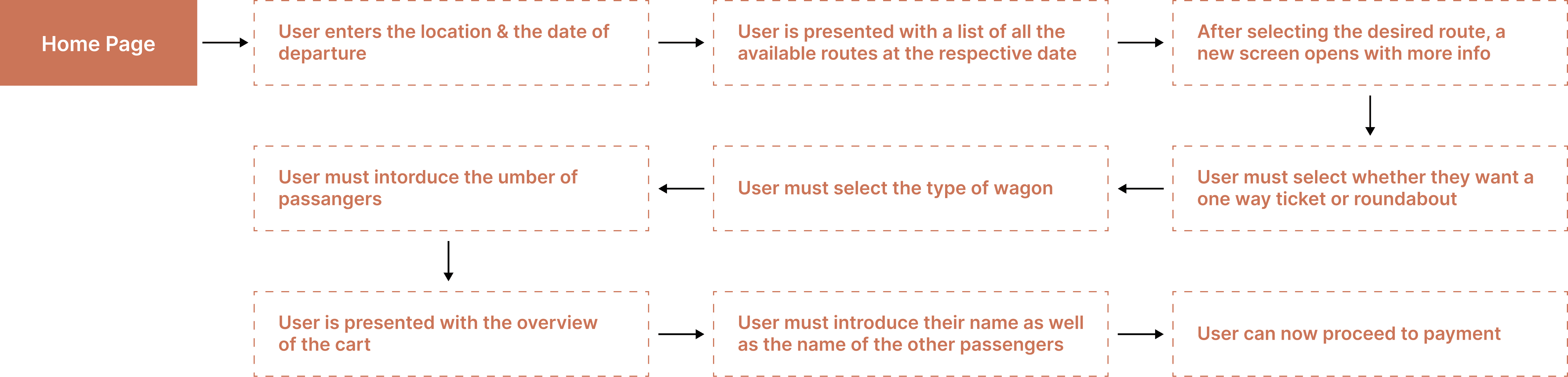
Proposed flow for authenticated users that want to purchase a ticket

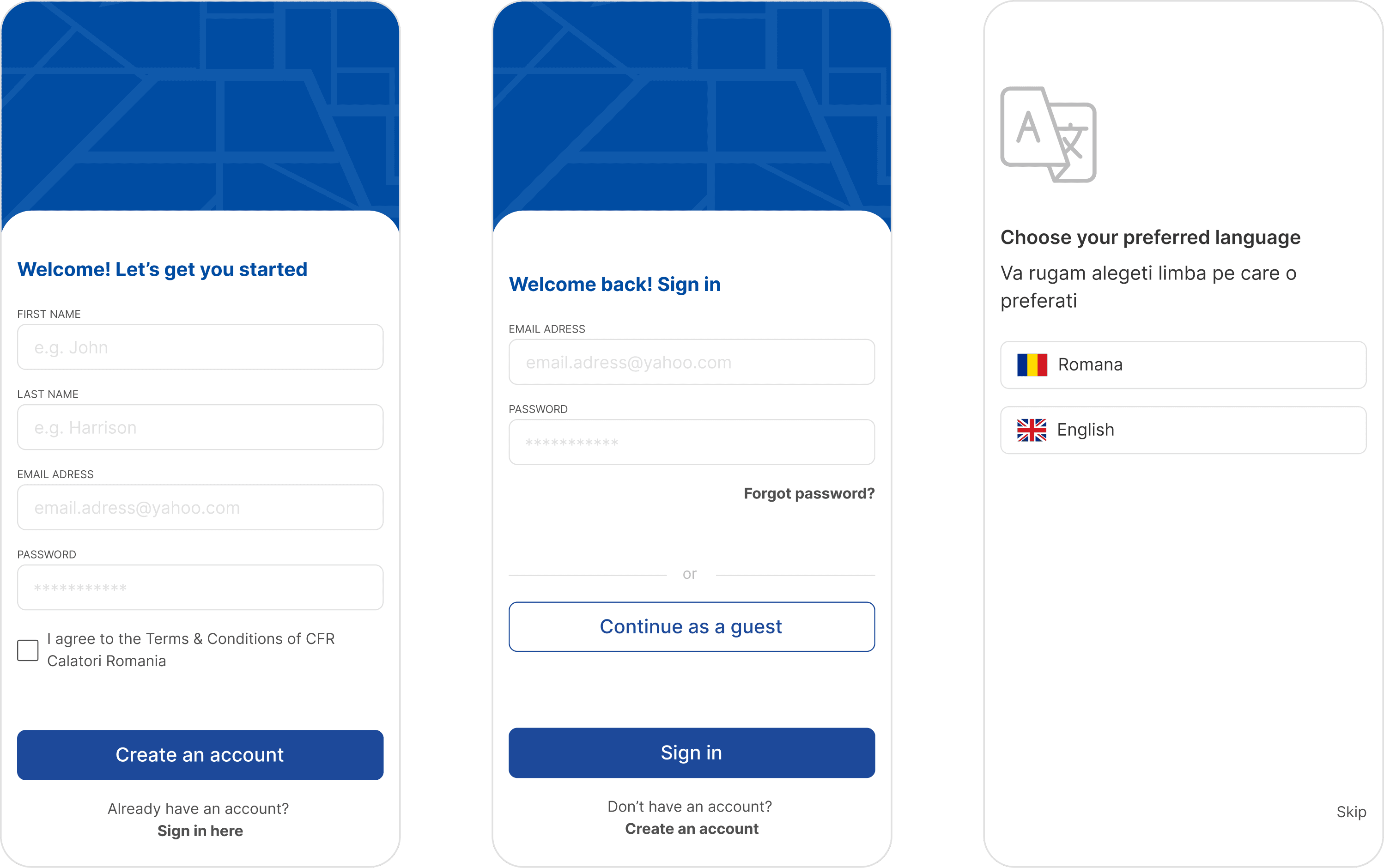
Optimizing the flow | Login / New account
As soon as the user opens the app, they are directed to the home page without the option of creating an account or logging in. This can be:
Misleading: because the user will believe that having an account is not necessary only to find out later in the process that they need one
Disruptive: The user is fully committed to buying a ticket only to be interrupted by the fact that they have to log in.
Proposed changes
Offer the users the possibility to create an account and log in right after downloading the app. In case the users may not want to create an account just yet, present them with a button that will allow them to continue as a guest.
Design thinking behind the cards
I wanted to create some minimalist cards that will respond to the users needs upon looking at the search results. My decisions were the following:
Prioritize the time of the departure & arrival as well as the time spent on the train. Users want to see the schedules of all the available trains so it makes sense to be able to rapidly scan the time.
Get rid of the repetitive text inside the cards. For finding more information the users will click on the card
Include the train numbers available for a suitable route because it informs the user about the type of train they will be travelling with
